I'm looking for ideas for a new design for the home page. I really don't like the huge carousel, as it takes up a ton of space and takes a long time to load.
If you see a site you think would be a good model for me to follow, please let me know.
I'm looking for ideas for a new design for the home page. I really don't like the huge carousel, as it takes up a ton of space and takes a long time to load.
If you see a site you think would be a good model for me to follow, please let me know.
That we always have to see the Theremini add must be a result of a contract..
So far the site works well to me. The carousel just displays what can be seen a few lines below, thus i'd prefer e.g. a daily by random choosen pic out of the photo albums. Or let the newest youtube or soundcloud theremin related video show up. This might be a little contextless but also could serve for an impuls.
Thanks for TW.
It would be good to have on the frontpage more updates on a weekly basis from less-known worldwide theremin players/artists.
There are plenty of people that are making theremin-related music independently, or in small labels or in Bandcamp and Soundcloud, the record industry -as we knew it- is dead anyway!
I agree with Dominik's idea on YouTube/SoundCloud feeds. I have no problem with the Moog banner if it helps paying the website's hosting fees, why not add more from other manufacturers if they afford to?
The biggest issue for me is the photo galleries. There are many photo links that ofter appear offline, and in terms of organization it's not ideal. It can be better I believe. Both in organization and content. Logo's lettering is also kinda outdated ;)
Thanks for the inputs. I'd LOVE for more manufacturers to advertise on Theremin World :) You're right... the Moog ad is a significant help in paying for site costs. If any other manufacturers would like to advertise, please contact me directly.
I think for now I'm just going to remove the carousel altogether until I can add the video feature. That's been on my list to implement for a long time, and I agree it's time to make an improvement there.
I'm also very open to suggestions on the logo. Some people have said they like the font, but honestly.... it was the "most interesting" font I had on my computer over 15 years ago when I made the logo. It's definitely time for a change :)
The biggest issue for me is the photo galleries. There are many photo links that ofter appear offline, and in terms of organization it's not ideal. It can be better I believe. Both in organization and content.
Thanks. Could you tell me more about what you mean by improving organization? I agree that the gallery isn't great. I wrote it very quickly as a placeholder until I could do something better, but I never got back to improving it.
"Could you tell me more about what you mean by improving organization? I agree that the gallery isn't great. I wrote it very quickly as a placeholder until I could do something better, but I never got back to improving it."
For example it would be nice to have one big category with theremin models and inside/ouside photos. Separated by manufacturer - model. This could boost the sales of the independent theremin makers as well. Another one could be the schematics that are available in public, without violating any copyrights etc. Another one could be the live setups of the theremin players, their FX chains or their studio setup. Then an "archive" photo section with scans from photos of the '30's and rare to find material. A category of recording sessions photos would also be nice.
You get the idea...now the photo gallery is set-up in an improvisional way, which is nice but you get easily lost as there is no structure.
Thanks. That helps clarify. I'll think about and see what I can come up with. This is great feedback!
I'm also considering moving the whole site over to Wordpress, but in order to do so I need to figure out how to integrate forms/comments/store into a single sign-on system and also migrate all the posts. If I had a real budget for this, I'd just contract that out :)
Please bear with me while I work on these suggestions.
Hi Jason,
a couple of observations:
'flashy things' on the page (any page of any site!) are distracting. eg the Theremini at the top right of the page - no problem with the advert, just the flashy-ness. Also the scrolling 'latest'. Is there a reason for this given that the wee photos and links are duplicated underneath?
Also, the TW font. Change the font if you want but keep the logo. Please don't remake the logo into something of a less fun design!
Thanks though for all of the work you put in to this site. The theremin community would be much worse off without it.
Roy
Thanks Roy. I have an update ready to push with the "latest" scrolling thingy removed. I don't really like the plain-ness that it leaves, so I'm working on a couple of options where either the topmost post has a larger photo (like ) or maybe breaking the home page down to show the latest posts in several category areas. I'll probably go with the first option for now, since I think it's the easiest to complete before the weekend.
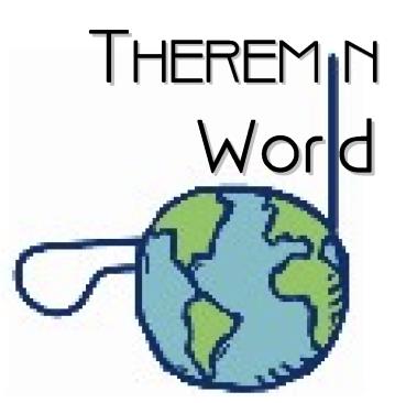
I like the logo image too... just not the "Ravie" font :) If we have any graphic designers amongst our members who would like to contribute logo/font ideas, I'm all ears!
"I like the logo image too... just not the "Ravie" font :) If we have any graphic designers amongst our members who would like to contribute logo/font ideas, I'm all ears!" - Jason
I created a new photo album anyone can post to and stuck some quick spitball kind of ideas in it. I'm no graphic designer, but I'm often pressed into service as such for our local historical society.
Since the Theremin was invented in the 20s, I thought an Art Deco font might be appropriate. I toyed around with using the logo antenna as the letters 'I' and 'L':




I guess I'm partial to the third and last. In the fourth "world" looks too much like "word".
Just throwing these out there to hopefully spur on ideas, please don't think I'm anxious for them to be actually used, particularly in the rough shape presented.
Dewster, I really like the Art Deco!
From your designs above my choice would be the first one, 3-5 are a bit too square in format for me, as opposed to landscape.
I had a quick photoshop thing and made the reworked version below-apologies for grabbing your design and messing with it but I thought it was easier than trying to describe it and in no way do I want to offend copyright stuff with what you have produced.
Roy
PS-In hindsight, the 'World' might be better in all uppercase as in your first image.
You must be logged in to post a reply. Please log in or register for a new account.